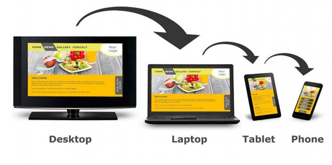
As day by day year passes, there is a need of change it may relate to fashion world or technology world. In this modern technology, no one seems to live in the same phase or use the same technology over a period of time. Many of the bridges take you to make best website designs but now we will take you to the most amazing trends for 2017 for your website.
Have a look forward for what stack we have for you today about responsive website design trends that you must know for the 2017 year running.
- Color, Big & Bold letters: For viewing any display it must be attractive and it comes from adding color. Not more but 2 to 3 bright colors are enough to use replacing the old fashion. It is not just adding attractive but it must be enthusiastic, refreshing and effective. Besides color effect big and bold letters are always on fly. A classic font in your website is added benefit for more customers.
- Use of Images and Videos: Images are the best way to express any kind of information. Relevant images are always eye catching to get attention of potential users. Background images are preferred which keep it simple and easy to understand. Similarly, goes with videos. Instead reading whole text, a short video will demonstrate the idea behind your service and products.
- Animation and GIF’s: Now-a-day advanced technology is implemented and all browsers are updated. Users also want something new and here it is for 2017. Use of GIF’s. Everyone hit like for GIF’s. Since these days we got huge response for this format and it’s a great source for capturing user’s attention. But it must be very well optimized. There we also go with animation. Animation goes hand in hand with GIFs. Something that is still and leave a mark for its realism. Sometimes we even can get its animated form. Interesting animation and simplicity take you to the best.
- Layouts: Layout properly used is the key to your website. Today’s trend of layouts goes with simplicity, flexibility, nicely described and viewed clean on the display. Modular designs and grid layouts are nothing but the designs being used past few years and seem to be continuing in 2017.
- Microinteractions: Microinteractions is powerful UI weapon for user interaction. It is very useful showing why you are here and guiding what your products can do. It includes small interactions such as sharing, liking post, filling a form.
You just need to convey your message about your products and services which you provide in a unique way to customers. Whatever may be the way of but it must grab the attention of users. There is no need to change the context but it should be represented in an attractive way. If you are one of them looking for best designs for your website, then none where look for. Web Design in India is the right choice for you. Create your amazing online presence.
Hope these trends will be seen ahead this year in most of the amazing websites. Make sure you just don’t mess up all the things to look trendy because all you do it for your customers and users.


